
30 January 2026
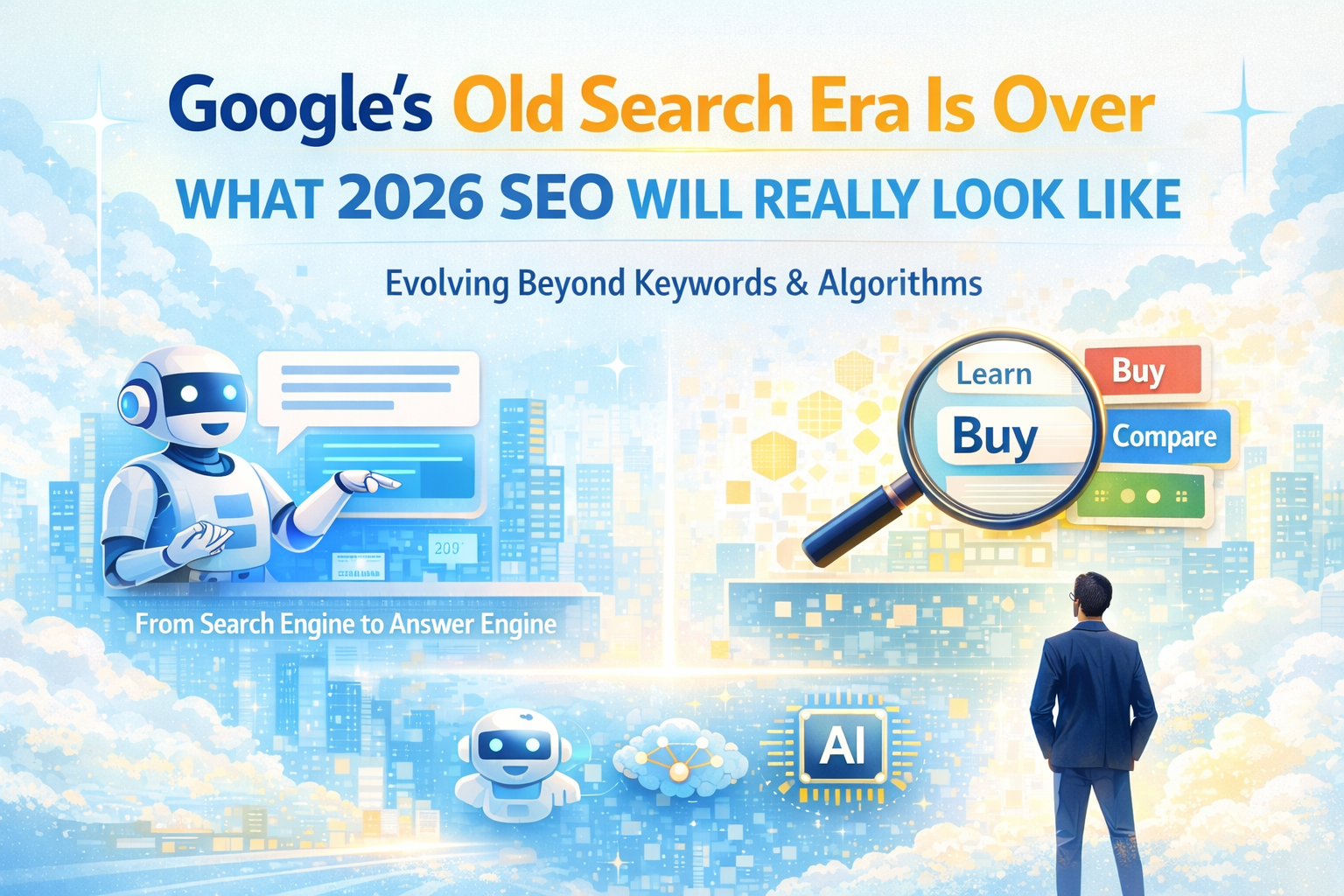
Google’s Old Search Era Is Over – Here’s What 2026 SEO Will Really Look Like
The old Google playbook is officially dead. Word counts, keyword density, awkward keyword stuffing, and robotic optimization tricks belong to a different internet—one that no longer exists. Search has evolved, and so has Google. What once rewarded mechanical repetition now rewards meaning, relevance, and real value.
READ MORE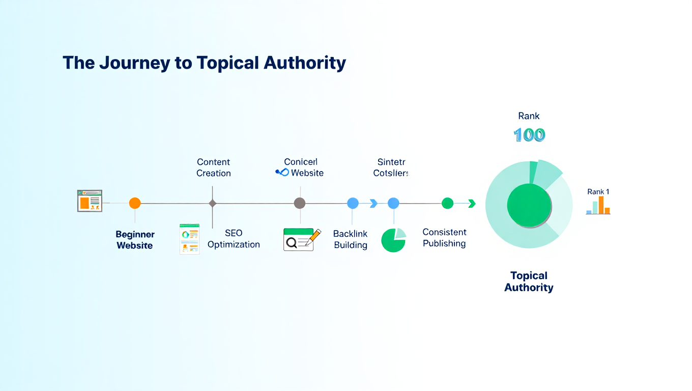
24 November 2025
Topical Authority: What It Is, & How It Actually Works?
This blog explains what topical authority is, why it matters for SEO, and how building deep, connected, and meaningful content helps a website earn trust, stronger rankings, and long-term visibility.
READ MORE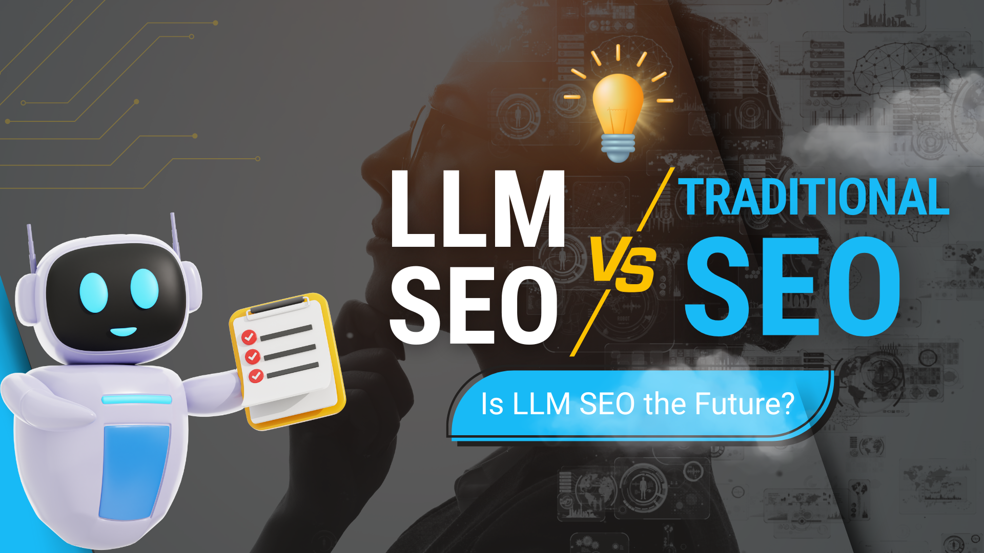
3 October 2025
Is LLM SEO the Future? How It Differs from Traditional SEO
Discover how LLM SEO differs from Traditional SEO. Learn about content structure, AI agents, and the future of search optimization.
READ MORE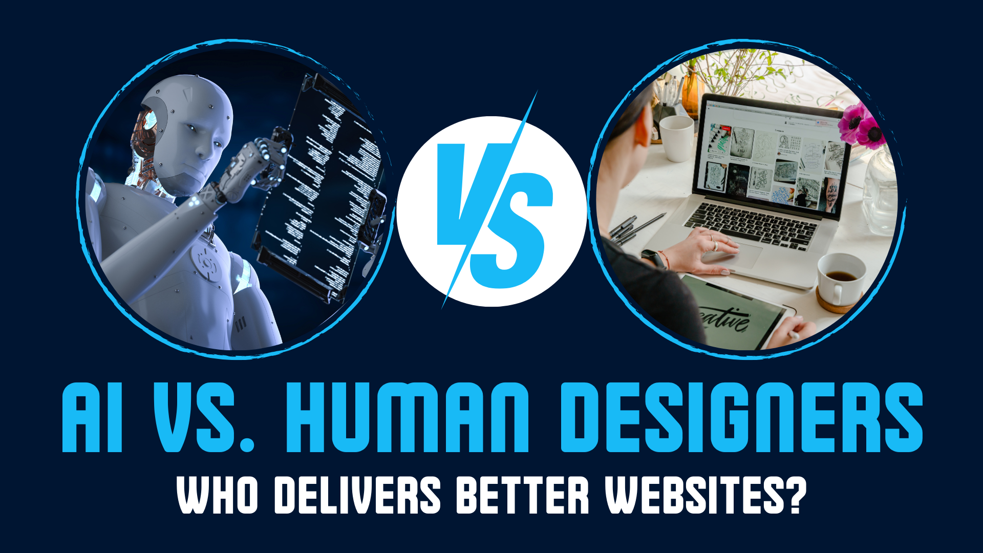
28 August 2025
AI vs. Human Designers in 2025: Who Delivers Better Websites?
Explore AI vs. human designers in 2025. Learn pros, cons, and the best approach for businesses seeking websites that balance creativity with technology.
READ MORE
31 July 2025
Why Flutter Is the Future of Cross-Platform Mobile App Development
Why choose Flutter for cross-platform apps? Uncover the power of Flutter app development—seamless UI, fast performance, and reduced time-to-market for your mobile projects.
READ MORE
1 July 2025
SEO for Restaurants: A Beginner’s Guide
Learn the basics of SEO for restaurants, including powerful local SEO strategies tailored for Indian markets and restaurant owners looking to attract more customers.
READ MORE
- 1
- 2
- 3
- 4
- 5
- …
- 18
Recognized for Excellence


